from dwell.com
ACME Real Estate’s Courtney Poulos was the buyer’s agent for this amazing renovation.
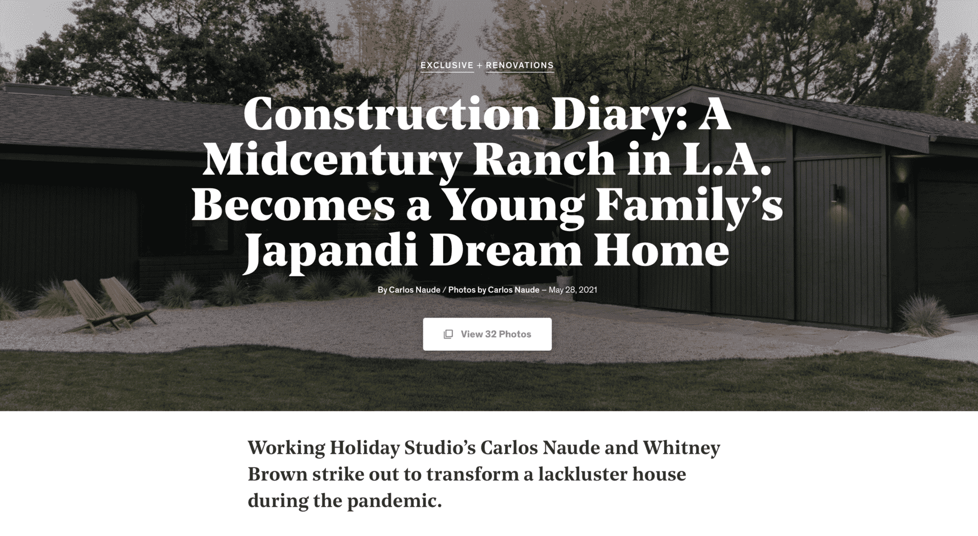
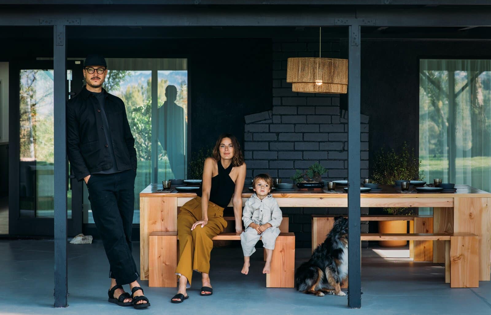
Carlos Naude and Whitney Brown, the couple behind Working Holiday Studio, are no strangers to turning humdrum spaces into Instagram-ready getaways and dream homes. After their recent successes, the creative duo geared up for their next project—this time, the renovation of their own residence in Woodland Hills, California, a suburb of Los Angeles.
Against the backdrop of the pandemic, Carlos and Whitney were on the hunt for a bit of calm and outdoor space. Below, Carlos narrates the journey in his own words.
1. Should We Stay or Should We Go?
2020 was a weird year with high highs and low lows. As soon as the pandemic hit, we realized we were going to be stuck at home for a while, and we needed to make some adjustments to the way we were living—fast. We considered leaving California for a smaller city, but our community, the weather, and the ocean were far too important to us to simply pack up and leave.
Our lease was about to expire, so the timing was in our favor, and we were fortunate enough to be in a position to buy our own home. Our budget was limited, however, so we knew whatever we found, we were going to have to get creative.
2. House Hunting
We narrowed down our search by differentiating between nice-to-haves and absolute musts. Knowing that we were going to spend a lot more time at home, outdoor space, an office, and proximity to the beach were our top priorities.
After an exhaustive search and many disappointments—many offers we put in were not accepted—we finally found our place. It was a wildly competitive market with properties getting 15, 20, 30 offers—some all in cash. Thanks to our wonderful agent, Courtney Poulos of ACME Real Estate, we were able to land this one.
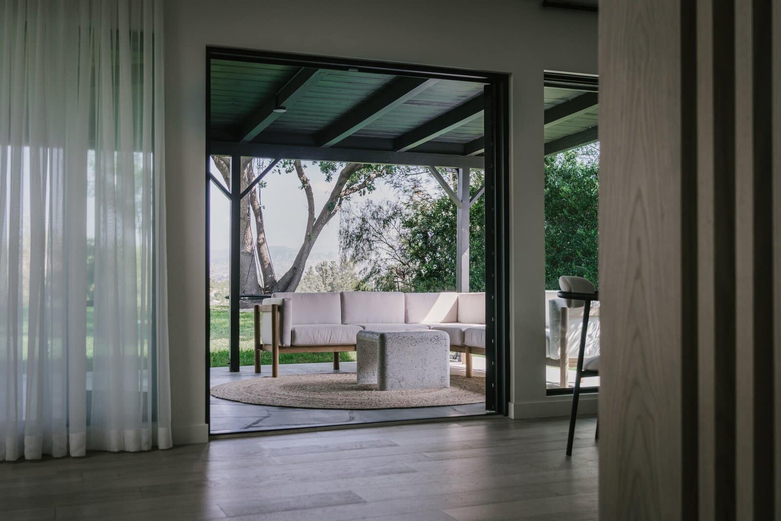
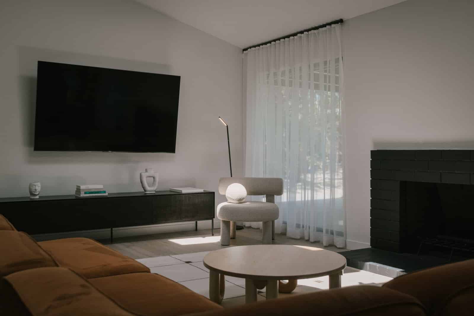
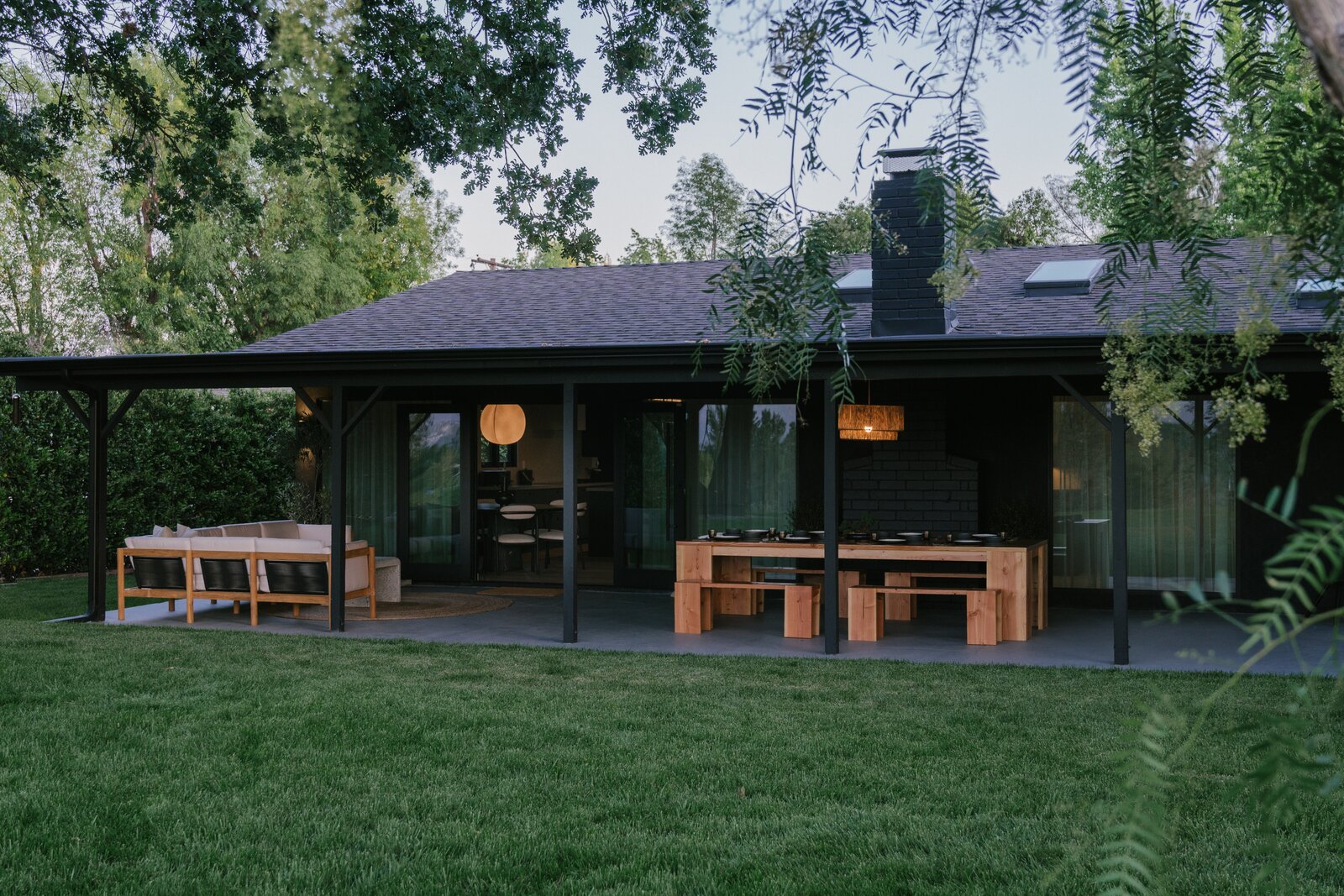
Our 1960s ranch-style home sits in a cul-de-sac, tucked away from the street at the end of a long driveway. The large living room has a fireplace and connects to the dining room with generous windows that allow spectacular views of the backyard and the expansive mountains behind. The main bedroom and en-suite bath enjoy direct access to the yard. The outdoor areas are definitely the main draw, and most importantly, the house is only a 20-minute drive to the beach through the beautiful, winding roads of Topanga State Park.
The catch? Well, the house was sold “as is.” Remember what I said about getting creative? This project was definitely going to be a challenge, as the house needed a full transformation.
3. Rolling Up Our Sleeves
The first thing we did as homeowners was take stock of kind of work the house needed, which was extensive: It called for new electric, plumbing, roofing, windows, and HVAC on top of cosmetic upgrades in the kitchen, bathrooms, flooring, landscaping, et cetera.
We couldn’t afford a general contractor, so we ventured into managing the project ourselves with the help and advice of our friend Zach Leigh from Goodboy Develops.
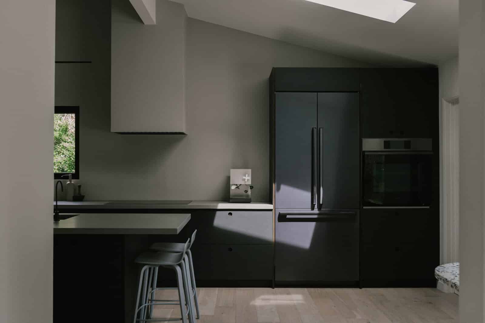
The kitchen felt pretty closed off, so we knocked out the back wall and reconfigured the layout to maximize space and open up views. Unfortunately, we found out that one of the beams was load-bearing, which would have necessitated bringing in an engineer and spending a good amount of money, but we came up with a solution by wrapping the beam in white oak to match the floors and creating a wood slat wall that’s become our favorite feature.
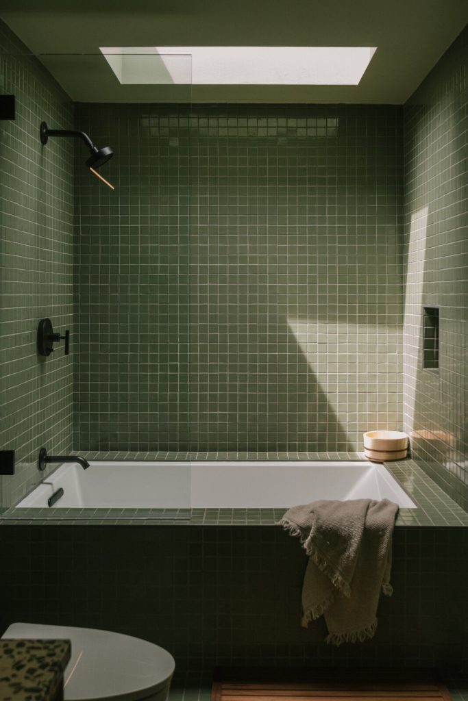
One of the biggest transformations took place in the guest bathroom. The main bathroom wasn’t wide enough to have a bathtub, so we reimagined the layout to include a tub here. We got rid off a door that led to the backyard and swapped the position of the vanity and bath, creating a horizontal orientation. Lastly, we added a skylight above the bath to bring in natural light and allow views of the sky.
When it comes to finishes, we usually start with an overall color palette to ensure that everything we choose down the road works seamlessly. Selecting materials and textures is one of the most fun parts of every project: Rearranging materials, creating new combinations, and being able to touch samples is a great way to make decisions.
4. Creating a Zen Den
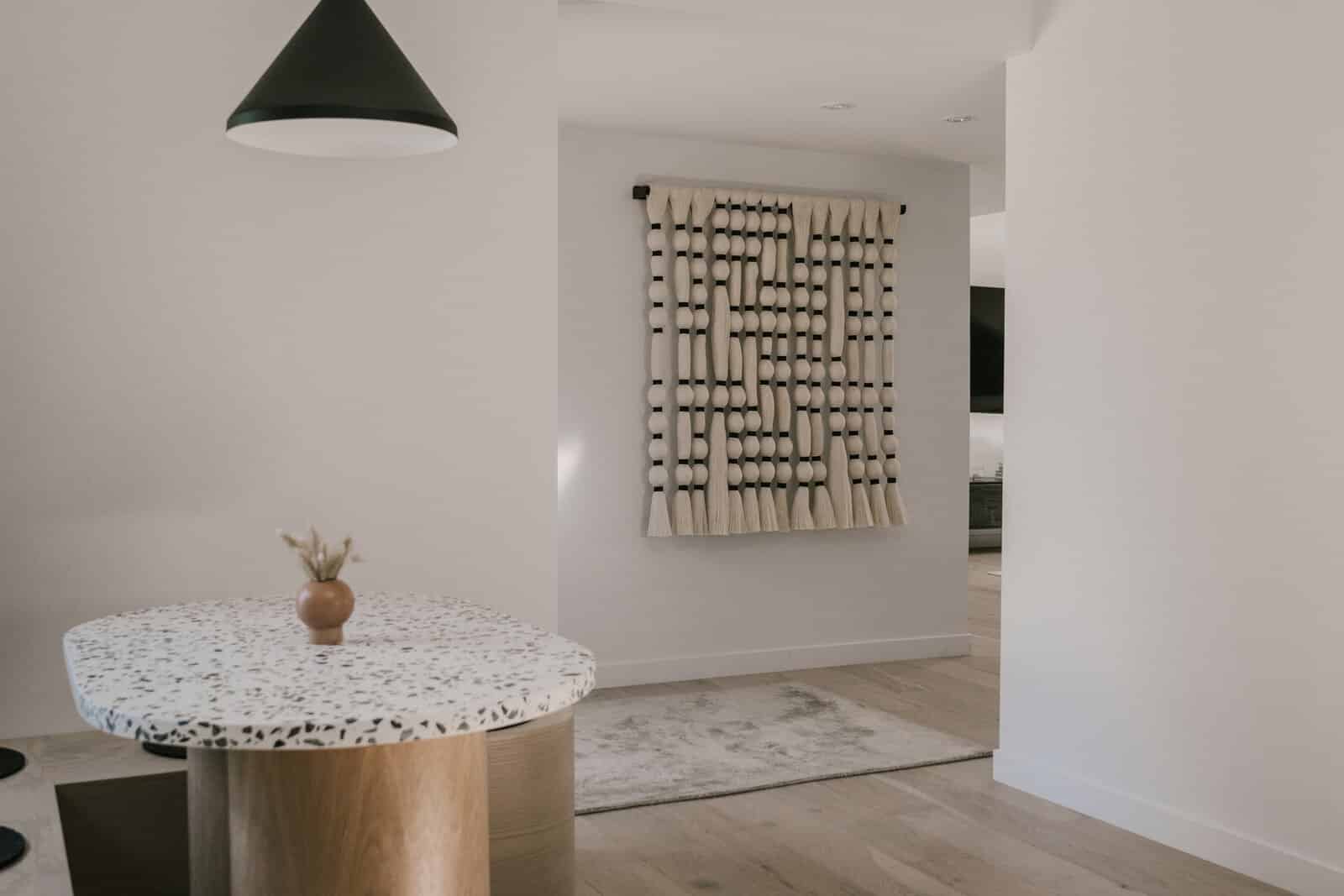
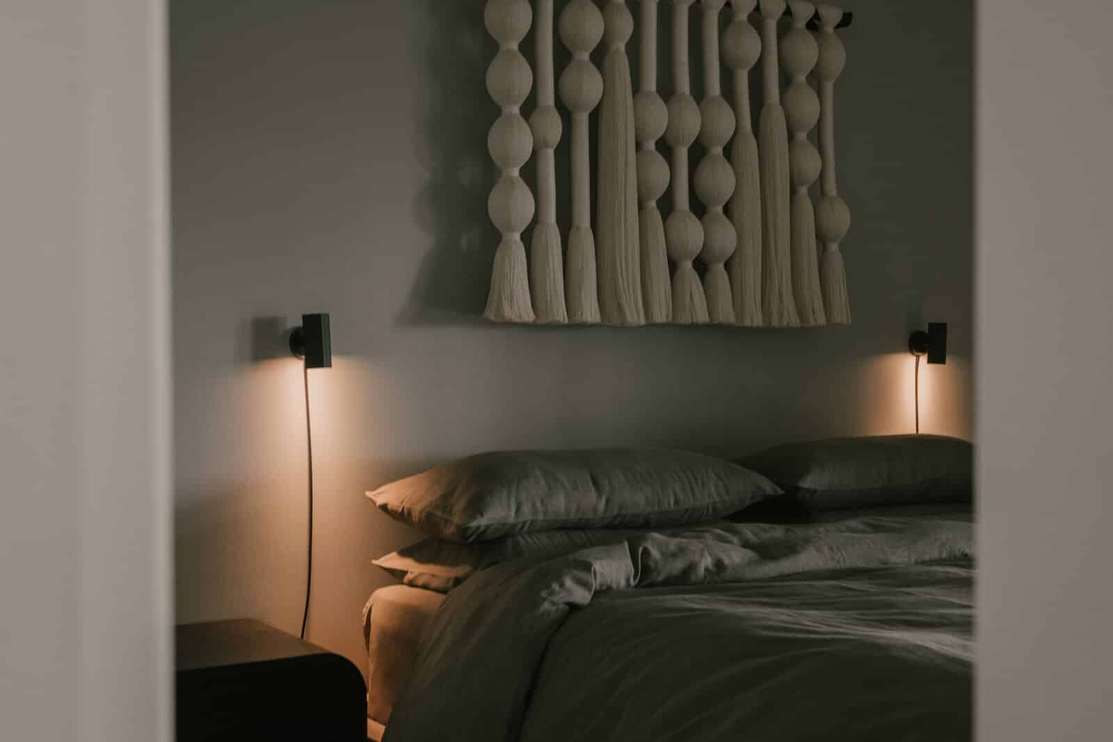
With the world feeling so chaotic, our goal was to create a space that felt serene, warm, and minimal: Scandinavian and Japanese design were our primary sources of inspiration. Given my heritage, it was also important to incorporate Mexican influences as well, like the dining set from Casa Quieta, wall tapestries from Caralarga, and smaller artisanal objects.
We christened the house Zen Den and ensured that the space would feel balanced and tranquil, incorporating neutral paint tones from Backdrop, soft linens from Cultiver, organic mattresses from Brentwood Home, and Molekule air purifiers. Five skylights in the new roof now usher in more daylight.
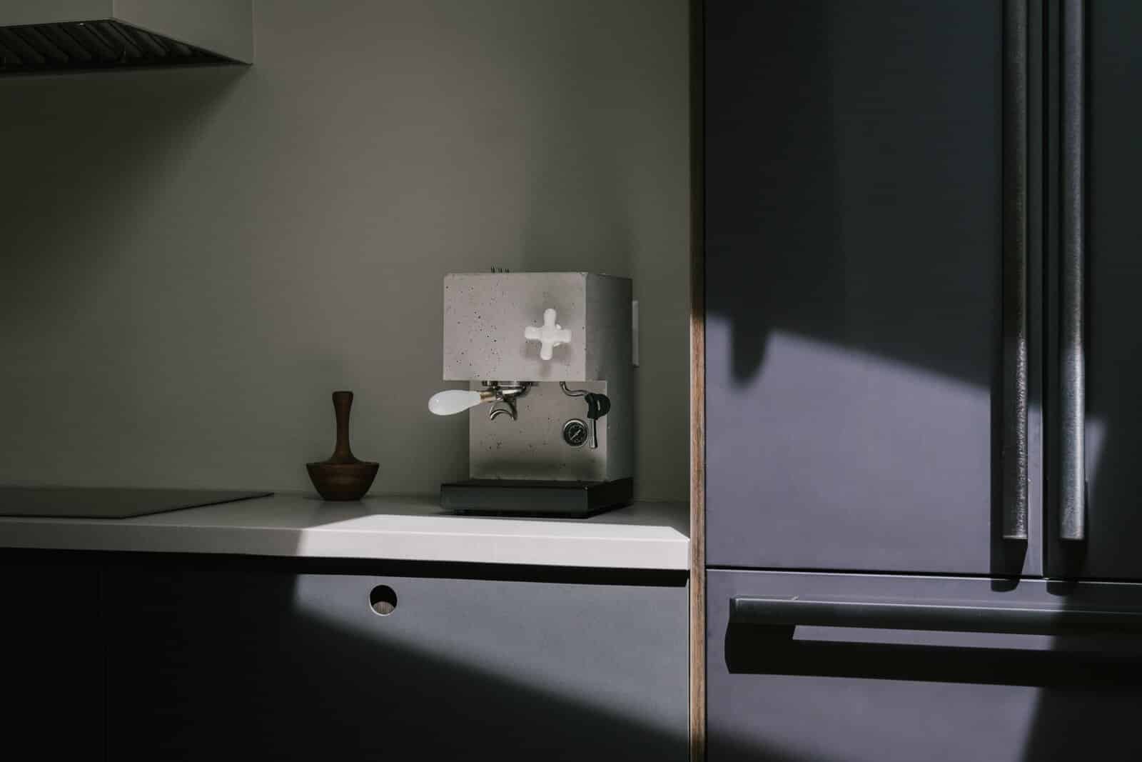
The kitchen is intended to be very simple, but highly functional: We went with Reform, a brand from Copenhagen, for the kitchen fronts, paired with Caesarstone countertops, which are easy to clean while still having a premium look. Matte black Kohler fixtures and Dacor appliances are sleek and tech-forward with touchscreens and Wi-Fi connectivity.
5. Lessons Learned
If there were one takeaway from this experience, it would be to get physical samples of absolutely everything! More than once, we ordered something while feeling confident about the color, texture, shape, or size, but once we saw it in person, we were completely disappointed—but at that point, there was nothing we could do about it. At times it may feel like overkill, but trust me: It’ll be totally worth it.
Also, if you can, avoid playing general contractor—you may have to spend a bit more money, but you’ll save yourself a lot of headaches.
We like to think that the spaces we create are fully immersive platforms that welcome people to experience them either digitally or physically. Zen Den is no different from that, so we created an online showcase of our favorite brands and designers.

