We love the current all white everything trend that exists in Northeast LA and beyond. Always fresh and always fabulous, this blank palette can often transform a dull dark space into a bright and inviting sophisticated dream.
However, the end of the year always marks an upcoming Color of the Year from PANTONE. We welcome to new hues that are sure to add a pop of inspiration for interior design throughout 2017. Here is our review of the best of the best colors!
Pantone’s official Color of the Year for 2017 is Greenery. Their announcement comes with the following comments: “A refreshing and revitalizing shade, Greenery is symbolic of new beginnings. Greenery is a fresh and zesty yellow-green shade that evokes the first days of spring when nature’s greens revive, restore and renew. Illustrative of flourishing foliage and the lushness of the great outdoors, the fortifying attributes of Greenery signals consumers to take a deep breath, oxygenate and reinvigorate.”
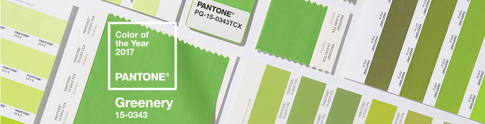
This color does feel like a breath of fresh air and a rebirth of design inspiration. Current trending white hues have given us a blank palette for building upon with accent colors and unique decor. Pantone rolled out a few color pairings along with their Greenery Color of the Year that we think would make incredible palettes throughout the home. The pairings we were drawn to have lots of earth tones that boast neutrals and muted colors.
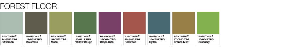 Forest Floor features several shades of green that could be combined to offer a rich and sophisticated tone throughout your home. Especially when it comes to throw pillows, we love mixing and matching patterns and different shades of the same color to add personality and variety!
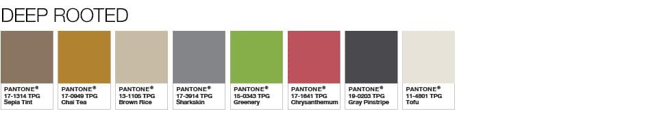 Deep Rooted has perfectly named soft tones, like Tofu and Brown Rice. These colors are a slight variation to our beloved whites that when added in the right way, will offer a sense of luxury and elegance. Same goes for the grays in this mix. You can never go wrong with neutrals, especially when they are tactfully and tastefully added.
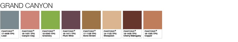 Grand Canyon includes Canyon Clay, a pink hue that we already often see in design accents. Trendy and on point, yet here to stay. This rosey tone, mixed with Coppers and Plum Wines promotes a rich and warm vibe. Comfort mixed with style is always a win, especially when it comes to home life!
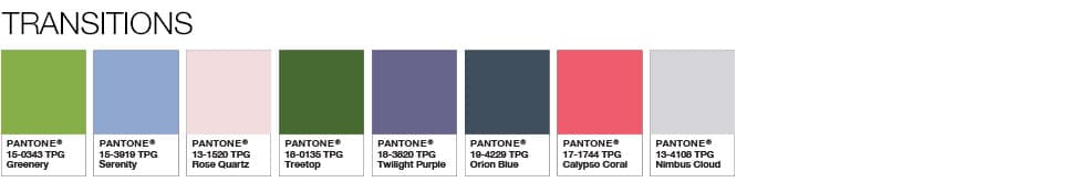 If bright and bold is your thing, then Transitions is for you! Greenery already makes a statement, but when mixed with the eclectic variations of Calypso Coral and Twilight Purple, you will be taking your originality to the next level. When Spring rolls around, you’ll be one step ahead when your florally bright interiors match your garden blooming outside.
We also love looking to Behr for the best in paint pairings for the year ahead. This year they broke it down into three categories: Comfortable, Composed, and Confident. Safe to say, if you’re looking forward to 2017 as much as we are, it’s because you intend to enter it with these three words at the forefront of your attitude.
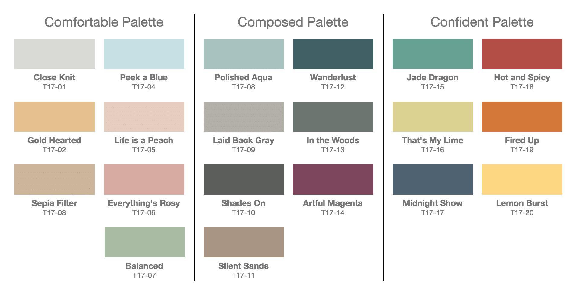 The Comfortable Palette feels very Cali-fresh with soft tones that makes us feel relaxed and at ease. Very in tune with what we currently see in homes, this pairing of colors will certainly continue to make a big impact in home design in 2017.
Composed is the powerful and sophisticated version of Comfortable that packs more of a punch in terms of bold and deep hues. This mixture reminds us of the Pantone color swatches and feels like a mature way to add variety to your home.
The Confident Palette is a bold take on putting your best and most unique foot forward. Pops of powerful color like Hot and Spicy or Lemon Burst are sure to bring pizzazz, personality, and cheer to your daily life at home.
We can’t wait to start seeing these colors pop up in interior inspiration, home decor, and new listings! If you get bit with the design bug and implement these colors into your own home – whether it be with paint, design accents, rugs, textiles, and beyond, we would love to see photos. We love when our clients and friends share their unique style and excitement for design with us!
SEND US AN EMAIL at hello@acme-re.com
 ACME Real Estate | Los Angeles Boutique Real Estate Brokerage